Datatable
I designed and oversaw the implementation of a new DataTable component to replace a previous one that lacked some basic features. Because Datatables should adapt seamlessly as the dataset changes, I placed a strong emphasis on ensuring scalability so that the tables could accommodate varying data sizes and maintain optimal performance without sacrificing functionality. This approach allowed for a cohesive and efficient user experience, regardless of the dataset's size or complexity.
Problem
The previous table did not meet enough use cases, which pushed teams into implementing different solutions with vastly different experiences across the platform.
Goal
Unify the experiences and make consuming table data a consistent, unique experience, providing solutions for current scenarios. Improving overall usability, considering best practices regarding main tasks, features we identified with the user research, and current usage.
Assessing product needs, conducting research, and analyzing the current landscape.
Data tables in New Relic must host vastly different types of datasets with their cases and characteristics. We must provide a consistent pattern that will work with most use cases, with strong focus on scalability for dataset changes. This is why all solutions applied to the table must scale to provide a good experience when the dataset increases. To improve the overall usability, we needed to consider different things:
Current usage and teams needs. Evaluating the current usage helps us to determine the adoption needs to prioritize the features. It also helped to identify gaps, and to discover specific use cases.
Best practices & Benchmark. To deliver a familiar, intuitive DataTable we took a close look at other tables in the users’ environment, focusing on developer tools (AWS, Azure, GCS…). This helped us to identify common ways to resolve shared problems, like sorting, reordering, etc.
Research findings. Some features we identified with the user research, which consisted in interviewing users and finding high-value features.
With all this information, I created a basic capabilities matrix to understand how the features related to each others, and their place in our roadmap.
Capabilities UX Matrix (Research findings + Audit & adoption needs)

General behavior
Data tables are structured grids of information used to organize and display data efficiently as your dataset changes. In New Relic, they must host vastly different types of datasets with their specific needs, so one of the core characteristics is their scalability.
We use data tables to help users scan and compare data quickly, detecting data patterns. Main user tasks:
Compare and Locate data:
Locating relevant info: Enabling users to keep their place as they move their eyes across the table. Sticky header rows & columns, borders, hover-triggered highlighting…
Making Information adjacent for comparison: Hiding columns, reordering columns...
Find records that fit specific criteria: This might involve filtering, sorting, using a search feature, or just visually scanning the table.
View or expand a Single Row: Non-modal panel or separate window, opening the row as an accordion, etc.
Taking action on records: (for example, deleting, sharing…) Single-Record Actions, Batch Actions, (or) Generic Actions menu
The highest return on experience for the broadest user base involves prioritizing certain features: drilling down to gain more context, improving truncation, horizontal scroll, and data visualizations.

Compare and locate data
Horizontal Scroll When a table is used for comparison—for example, market performance data—it is critical to maintain a traditional row and column-based layout that allows a user to compare cell values across multiple rows.
Sticky header Help users locate relevant info and keep their place as they move their eyes across the table.
Sticky columns Locking the driver or actions column in place to provide a consistent frame of reference.
Resizable columns Tables are used to scan and compare data quickly. Resizing columns helps with, for example, name truncation or allowing users to see more information displayed on their screen.
Hover-triggered highlighting: We don’t use “zebra striping” on rows because there is enough visual delineation (spacing and borders) to track a single item across the whole row visually, and they cause usability problems when there are few rows because users may ascribe meaning to the highlighted rows. Instead, we introduced a smarter pattern of hover-triggered highlighting to help users keep their place as they move across the table.

Find records that fit specific criteria
Single sorting and Multi sorting. Organize and find the data you want to make effective decisions.
Basic search at a datatable level An optional prop, useful when the table is in another part of the page (e.g., at the bottom, after some charts, etc.) The search parameter stays in the text field when using a basic search.
Basic curated filtering (dropdown menu) Pre-defined dropdowns let users quickly pick from pre-defined filters without knowing how to use the filter bar. (e.g., “Sort by [parameter]”) with obvious and quick access.
Advanced filtering As a rule of thumb, the filter bar should be used for general table filtering. It’s usually on the top of the UI as part of the navigation template. It is handy if the table is right below because users can see the parameters applied immediately. Since it filters all content below, it applies to any accompanying charts or summary data.

View or expand on a single row
Tree View (Nested Rows): Expandable rows in the tree view provide a hierarchical structure for organizing and visualizing data. This is valuable when dealing with data that has a natural nesting or parent-child relationship.
Expandable row (Dynamic content): Expandable rows can also create views that provide a quick overview of data while allowing users to delve into details when needed when there's too much information to show, and the table can't display all at once.

Taking action on records
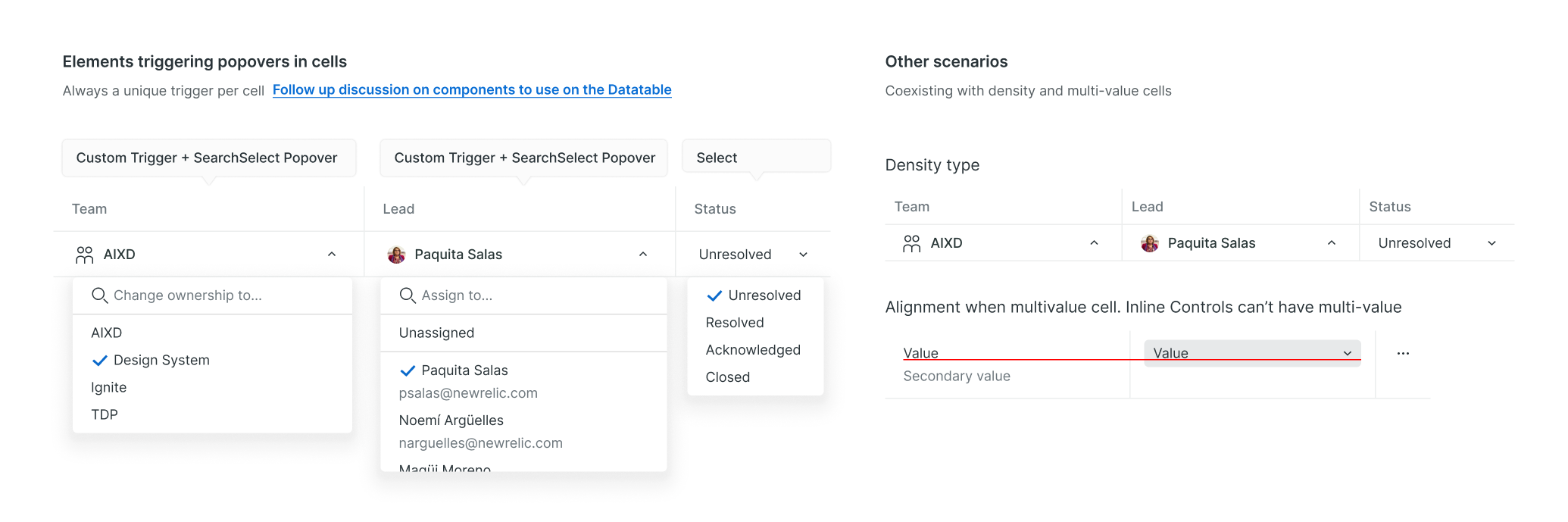
Overflow menu Some tables allow the users to perform one or multiple actions on a row of data, such as cloning a dashboard or deleting a workload. Actions in a table row actions affect only that row, never other rows. As a typical New Relic and web-wide pattern, these row actions are placed in an Overflow menu that leverages the Dropdown and Menu component and scales up easily to adopt multiple actions.
Surfaced actions: We can surface recurrent common actions (two or fewer actions). Use buttons with or without icons.
Inline controls in cells: Inline menus allow selection from a predefined set of menu items (e.g., Resolve, Ignore, Assign...). They're embedded directly in a table cell. Since the inline menus can’t have labels (other than the column name), their values must be easily understood.
Customizing the Datatable
Our users can end up dealing with lots of data, so it’s essential to provide customization of the table view. According to research, there is an intense desire for easy editing of each table, and “the expected experience is an edit button with a checkbox of settings.” A user comparing another table said: “Here you can re-order and other smart stuff... Visually it is very simple, unscary... I really like that (the button). I think it’s very friendly.” It’s simple and very familiar since it’s a pattern used by tools like AWS, Datadog, and Google Cloud Platform, and Notion.
A button on the top right of the table gives users a dedicated configuration interface for reordering columns, setting visibility, and other general aspect options.
Hiding / Displaying columns This functionality aims to help users compare adjacent data, based on their use case.
Lines per row. Allowing the user to increase the height of the rows to display overflowing text for as many lines selected, to read more data
Density view: Using a condensed row height will allow the user to view more data at once without having to scroll, but although it reduces the table’s readability.

Some other examples of how we see the data, behavior, cell types…
Temporal feedback highlighting: The highlighted row displays a specific background color for a second or less to signify a new addition & catch users' attention.
Static highlighting: The row is in a particular state that persists. E.g., rows that are especially important for users, or it’s useful that they’re distinct.
Visualizations: The Datatable can display in-cell visualizations the Dashboard UI team provides.
Attention types in metric cells. During the user research, users expressed their need to see alerts or actual content in colored cells to catch their status at a glance. This capability is key to adopting the DataTable since it’s a requirement for thresholds, core customization for users, and Service Level Management, which has a very similar threshold scenario.

Results
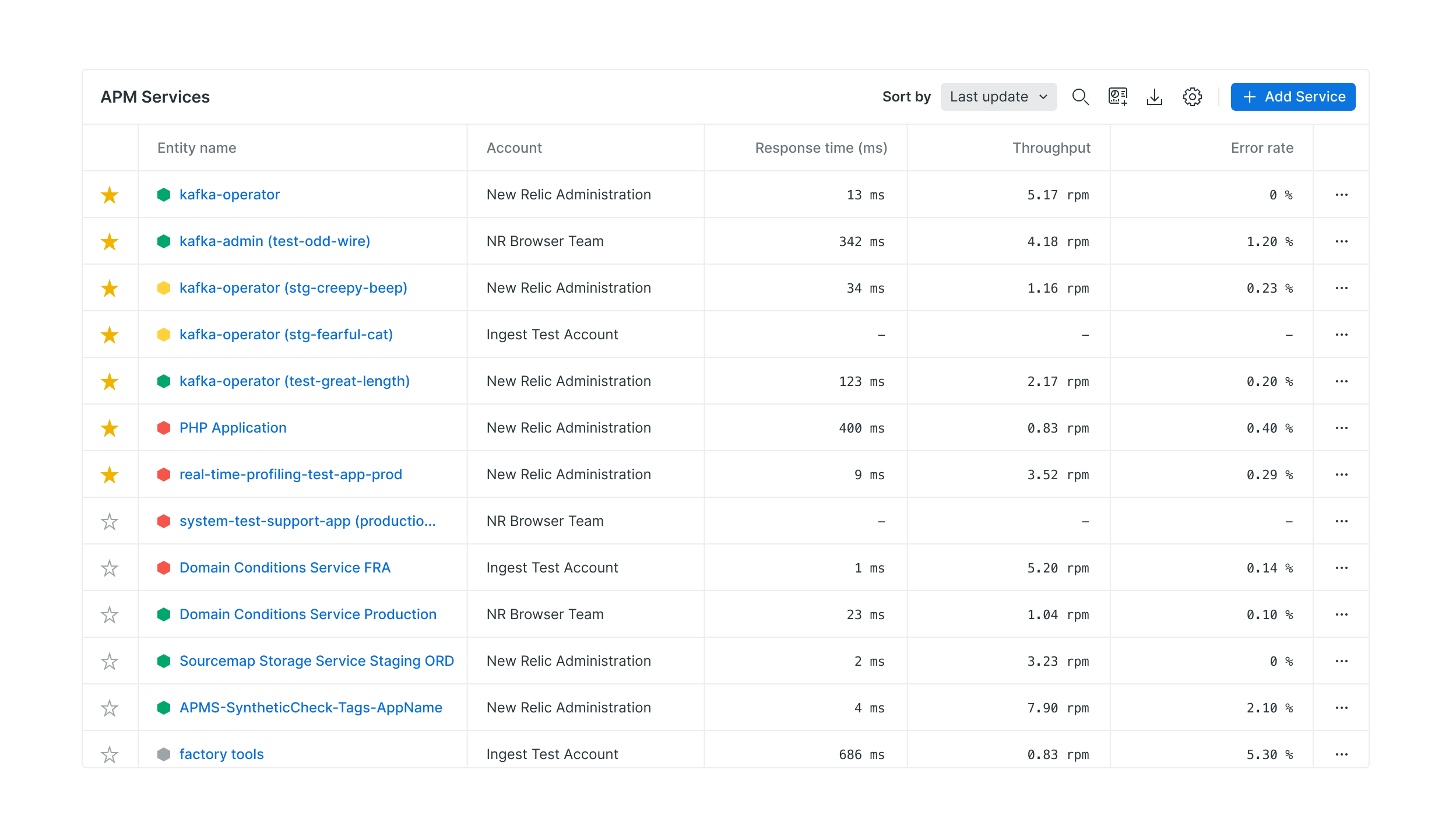
We helped at least 76 complex instances migrate to the new Datatable, and we’re currently at 95% of users seeing the new Datatable.
Accessibility improvements
We observed a 46% decrease in a11y-related bugs thanks to the Design System. This initiative fixed a lot of accessibility issues derived from teams implementing customized versions of the old tables.
Usability improvements
To promote adoption, we not only fixed usability issues, but provided teams with new features that would help their final users. The reception has been great, with users contacting us with positive feedback.